Stranger Things: Creating the Gateway into Hawkins
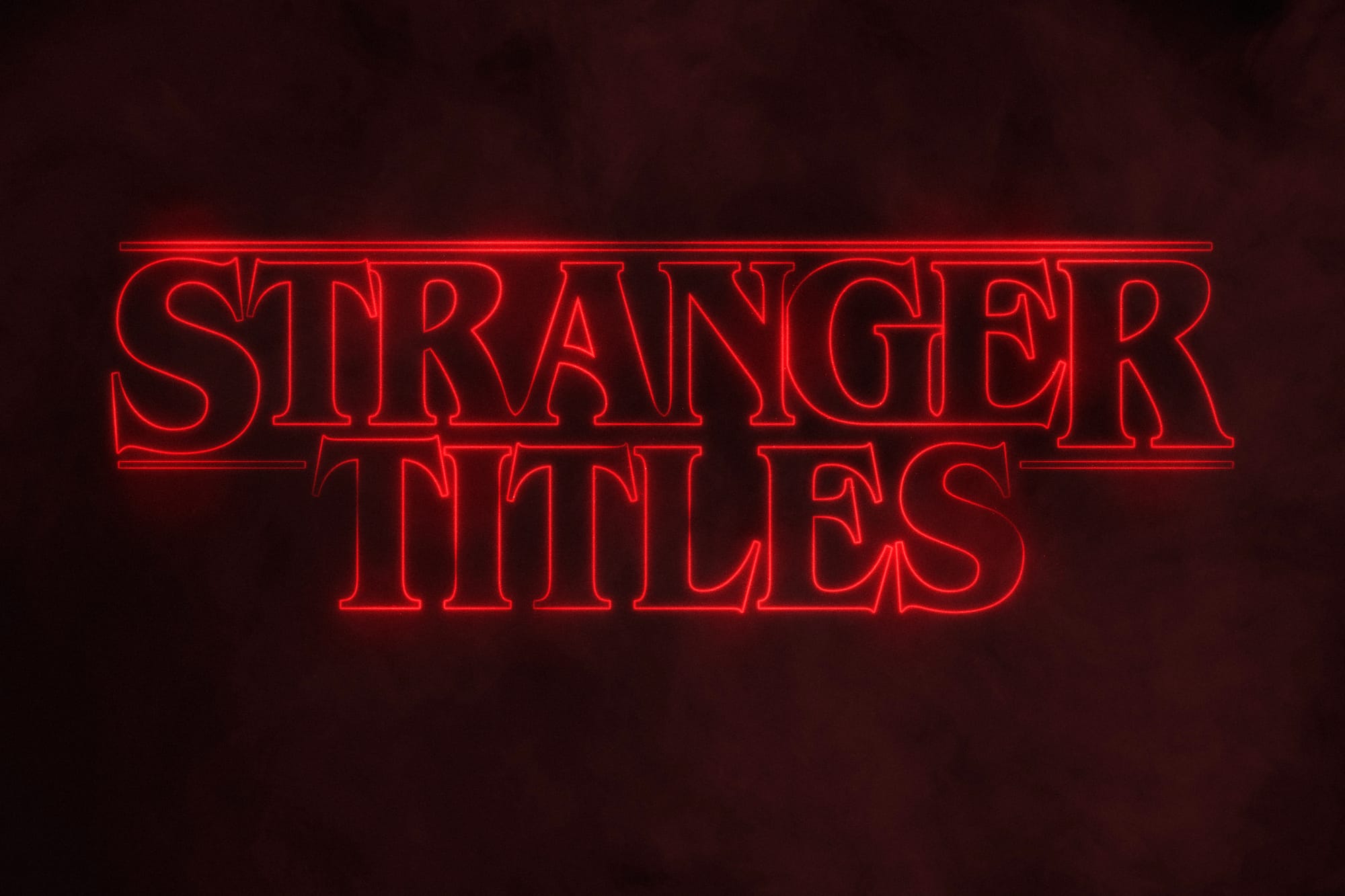
During our latest binge-watching sessions, many of us have our thumbs poised over our trackpads or the ‘OK’ button on our TV remotes, eagerly anticipating the appearance of the 21st century's big innovation: the ‘Skip Intro’ button. However, one programme where I find myself not reaching for this button is Netflix's hit series, 'Stranger Things'.
Filled with pulsating, fuzzy, and gritty red lines that gradually pull back to reveal the full title, the opening sequence of "Stranger Things" captivates just as much as its '80s-inspired theme tune. This soundtrack beats the show's chilling and suspenseful mood upon its audience, delivered in a distinctively electronic style. Notorious for their homage to blockbuster movies of the '70s and '80s like "Alien" (1979), "The Thing" (1982), and "E.T" (1975), the Duffer Brothers have famously drawn inspiration from these classics, and shaped them for the shows modern audience. This piqued my interest in discovering exactly what inspired the opening titles of the show.
Take a breath and grab my hand as we delve into the Upside Down to explore the origins of these retro visuals…
Chapter One: The Roots
In Gina McIntyre’s book ‘Stranger Things: Worlds Turned Upside Down’, the Duffer Brothers mention that they came up with the initial idea for Stranger Things in the Autumn of 2013, ‘inspired by the work of so many artists before [them]’, but mostly through the work of Steven Spielberg and Stephen King. In Season Two of the show, Dustin Henderson proudly proclaims that his books are his paddles he uses on his “curiosity voyage”. Well, it appears he is not the only one using books to steer. The Duffer brothers state that reading Stephen King’s early works (Carrie, Salem’s Lot, The Shining) is as much an ‘adolescent rite of passage’ as learning to drive or attending prom.
Over his decades-long and productive career, Stephen King has masterfully reached into our primal fears, with his stories of outcasts facing supernatural and spooky dangers. Those who survive these encounters are often irrevocably changed, and not always for the better. These tales not only serve as a metaphor for the challenges faced when leaving our childhoods, they also feature complex heroes and villains, whose intricate relationships and emotional depth make his stories particularly compelling.
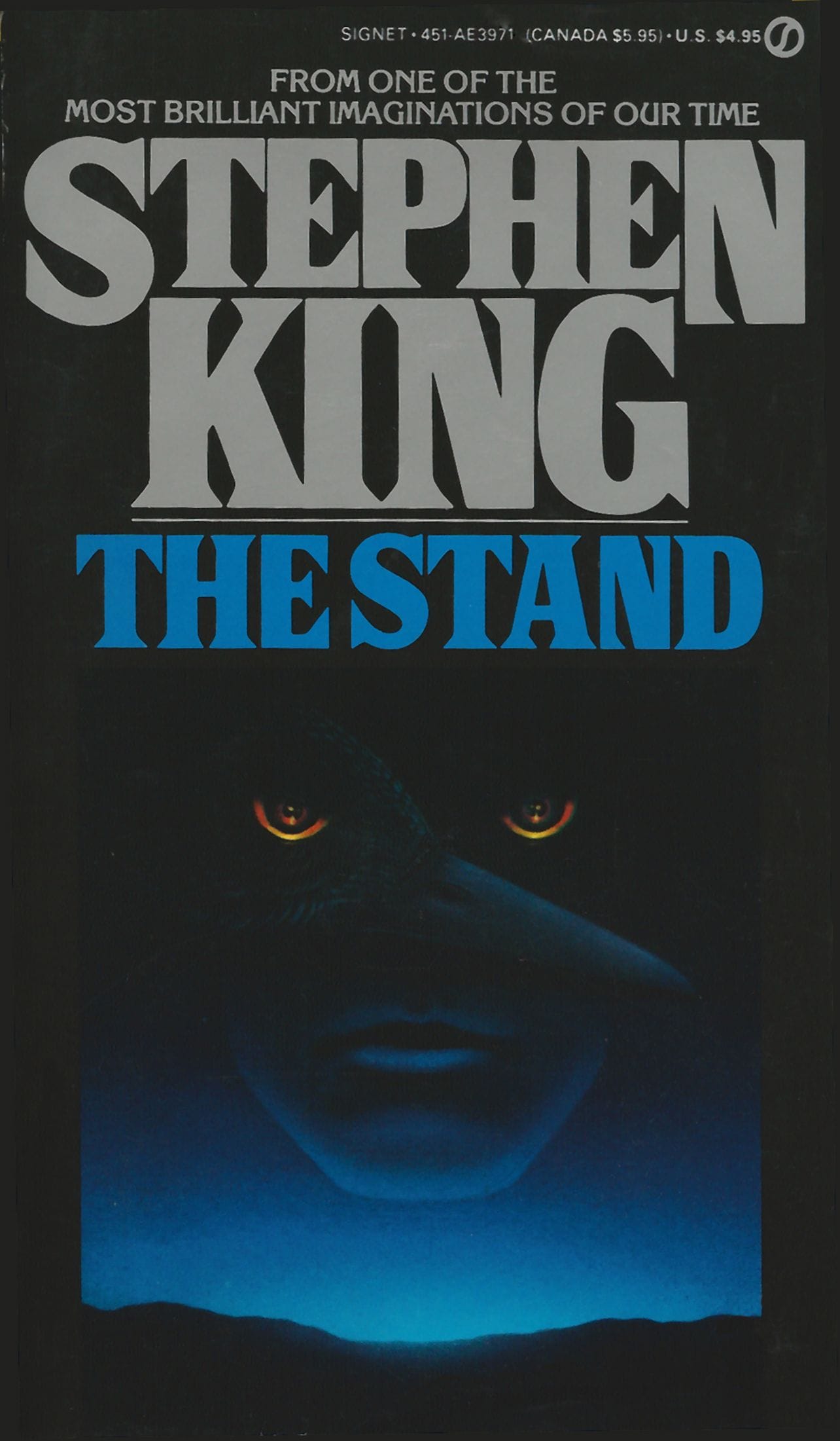
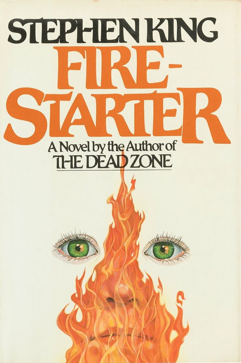
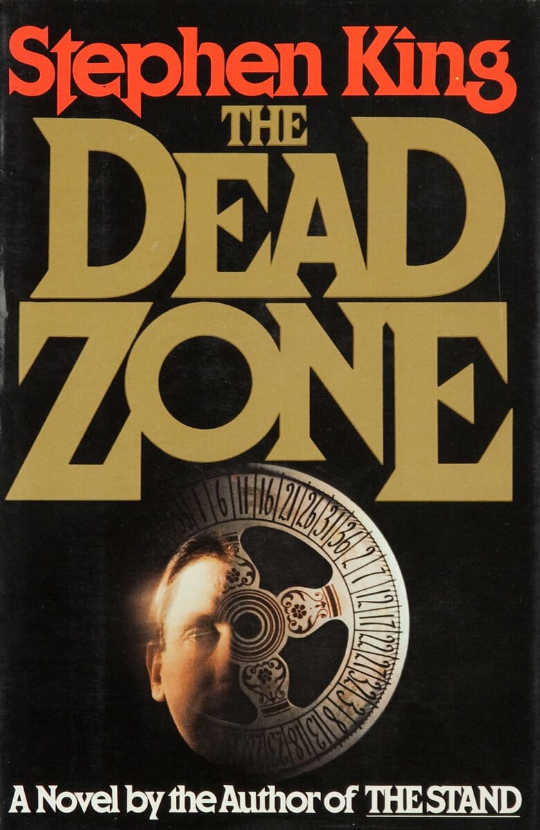
It’s easy to see how King’s storytelling has influenced the narrative fabric of the show. But what about the visual style, particularly the opening titles? A glance at the covers of his early novels reveals clear visual influences right from the start:
Chapter Two: A Blast From The Past
During the '70s and '80s, Stephen King’s book covers were known for their ability to capture the spirit of his spooky and suspenseful novels through striking artwork and design. During these decades, his covers primarily featured hand-drawn illustrations that aligned well with the mysterious atmosphere of the books themselves. While this artwork is striking, the typography used for King's name and the titles was also as distinctive as the illustrations. It was usually bold and straightforward, making the books instantly recognisable on book shelves.
One of the most recognisable fonts used on King’s covers throughout the 70’s and 80’s was ITC Benguiat, designed by, yes as you may have guessed, Mr Benguiat (Ed Benguiat to be exact) in 1978. This is a decorative Serif typeface and is seen on the front of novels such as ‘Different Seasons’ (1982) and ‘Christine’ (1983). Whilst the font is a product of its time, it certainly helps to enhance both the vintage feel and the suspenseful, eerie atmosphere within King’s novels. This font includes a range of weights and styles, including italics and bolds, which make it highly versatile for various uses in advertising, book covers, and logo design.
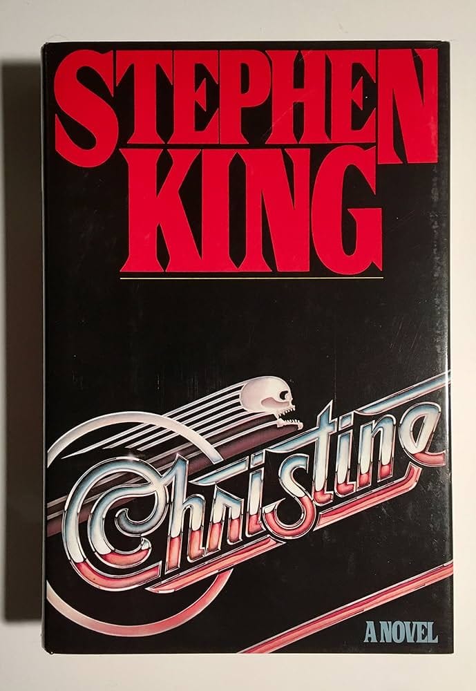
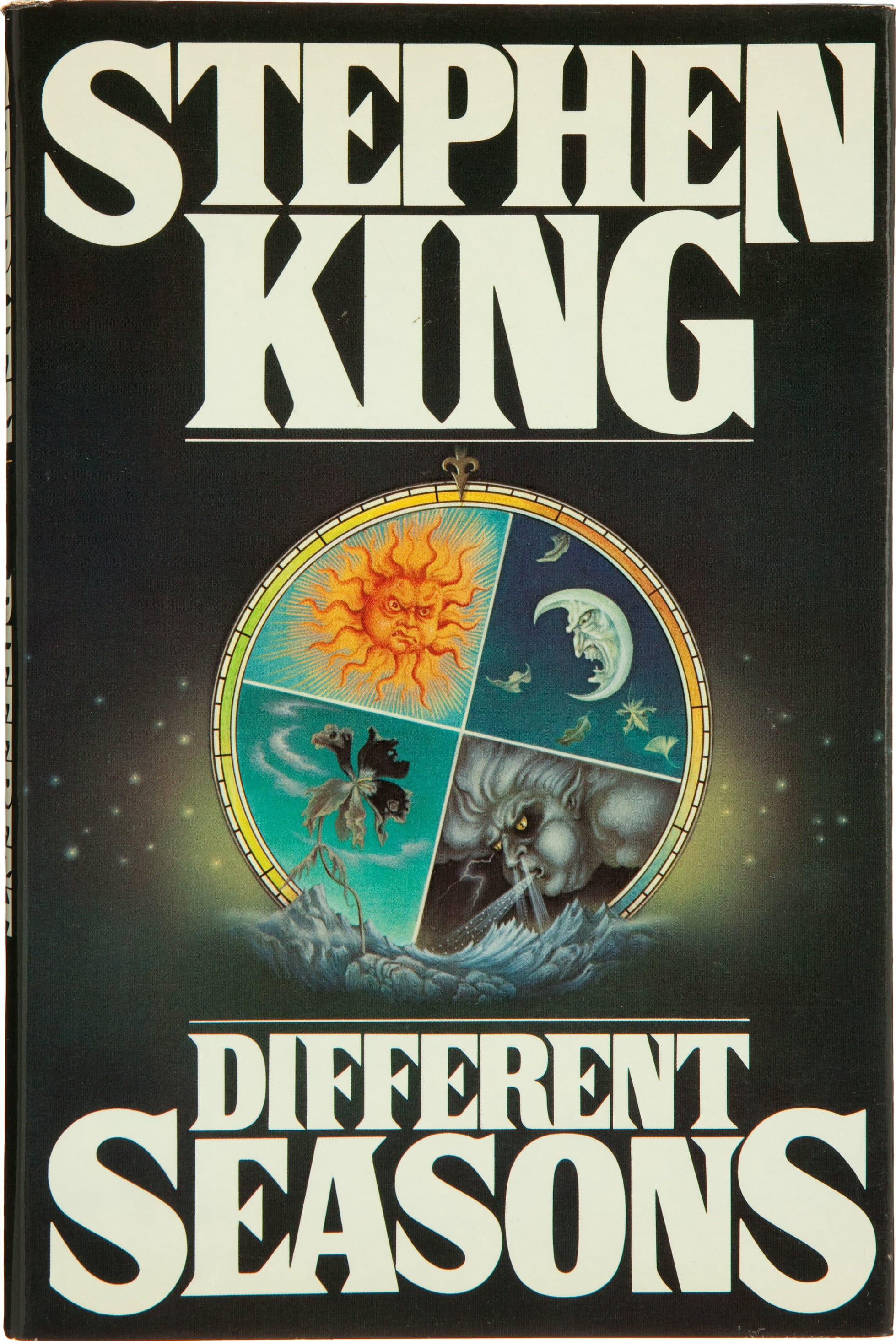
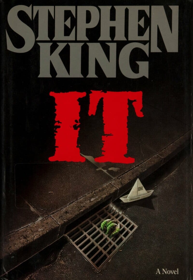
Alternatively, for some of the 1980s book covers, such as Stephen King's name on the 1986 hardcover of ‘IT’, another distinctive font used was called Pacella Latina. This font featured wedge-shaped serifs and was adjusted for aesthetic purposes on King's covers, again, enhancing the mysterious and intriguing vibe of the novels.
Chapter Three: Let's Get To Work
Back in the 21st Century, the challenge of designing the typography of the Stranger Things logo was taken on by the content agency ‘Contend’. The team collaborated with the Duffer brothers, who provided them with their copies of novels they had collected from the 80’s, primarily Stephen King novels.
Whilst you won’t be surprised to learn that the team settled on the ITC Benguiat font style in the final design, there is an interesting collection of drafts that the team presented to the Duffer brothers, before they decided on the now iconic look. The font 'Cortez' was an early contender (as seen in image 4 below), before they later settled on Benguiat. The final result (as seen in image 6 below) shows a blend between Stephen King’s cover for ‘The Dead Zone’, and the cover of Nick Sharman’s ‘The Cats’.
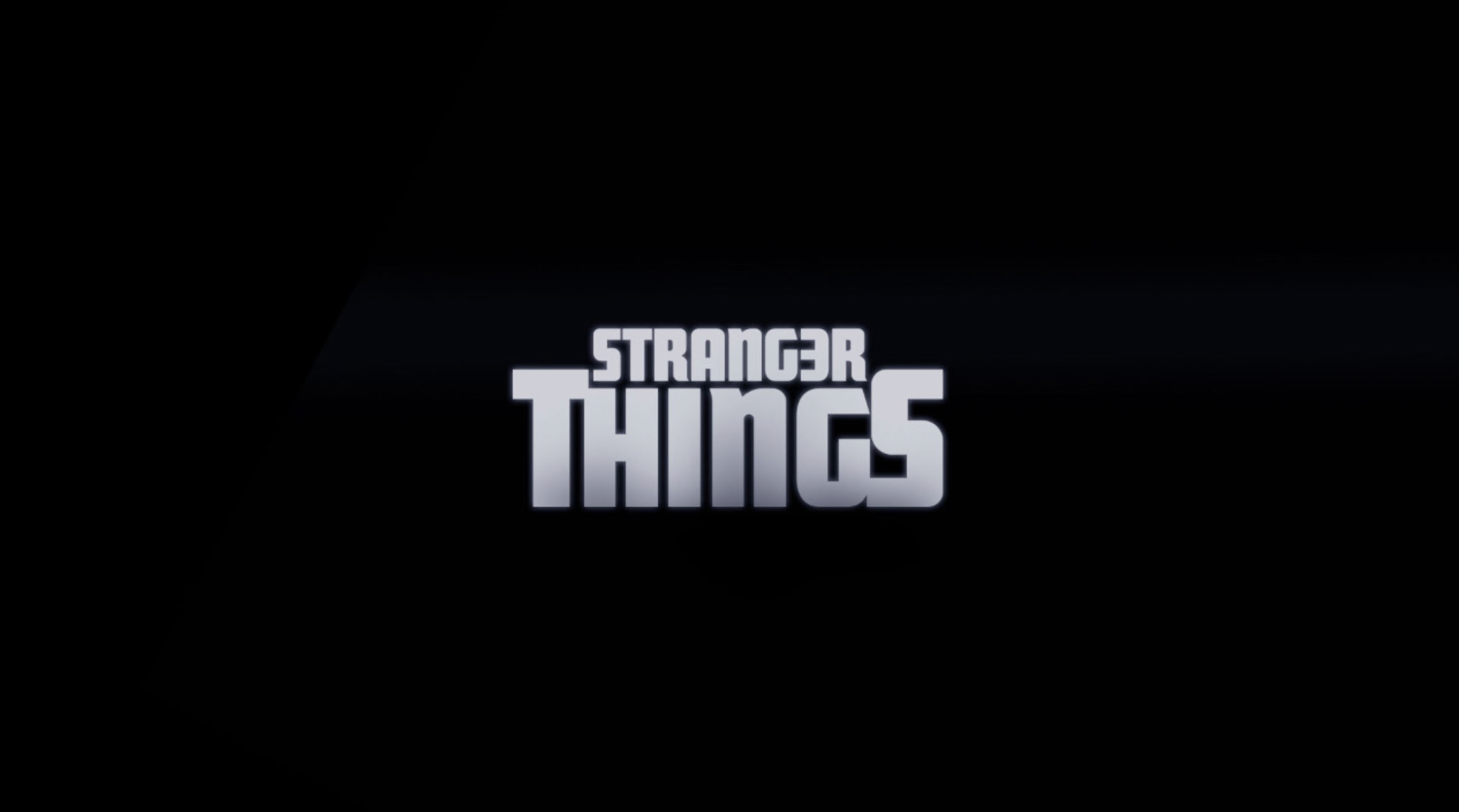
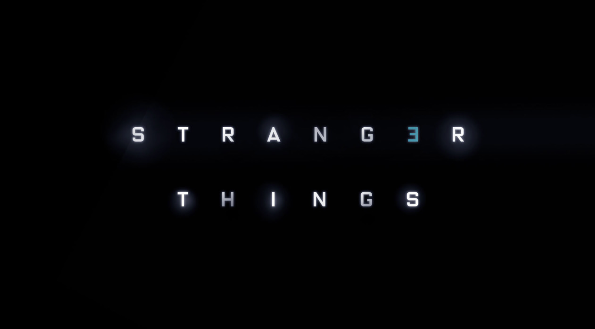
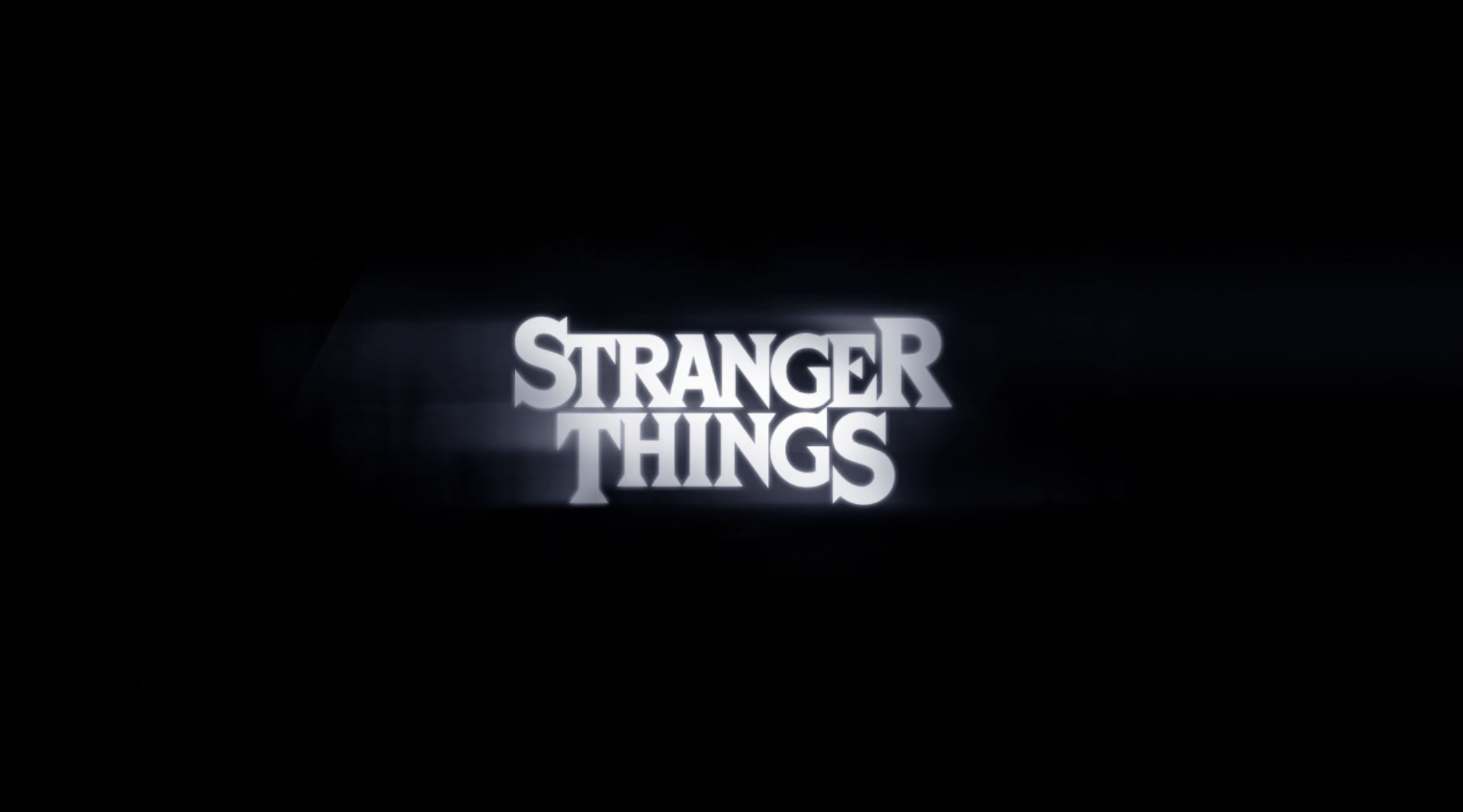
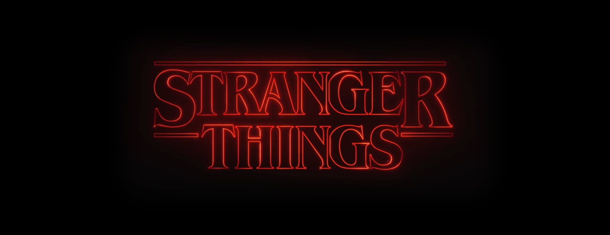

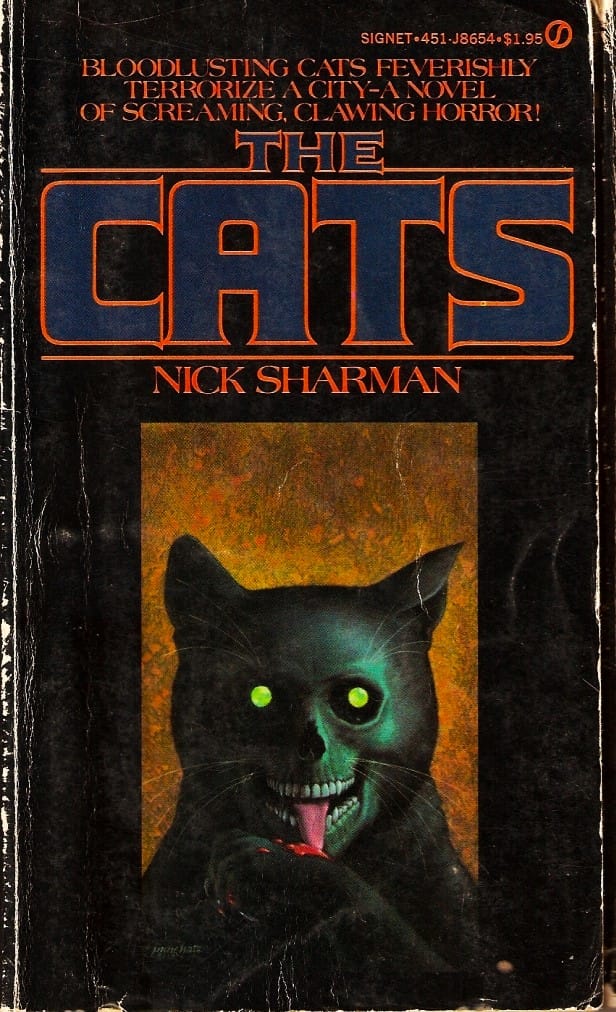
The inspiration for the larger S and R from the final logo can be seen depicted on the cover for 'The Dead Zone', with the red outlining present on Nick Sharman's 'The Cats'.
Now the look of the series’ title had been decided upon, it was handed over to the Los Angeles-based design studio Imaginary Forces, led by creative director Michele Dougherty. This team, known for their work on titles such as ‘Mad Men’, ‘Boardwalk Empire’ and Marvel’s ‘Jessica Jones’, knew they wanted a sequence which celebrated the show for its nostalgic homage to the 1980s, particularly the 'film optical' title sequences common during that era, used for projects such as Altered States (1980) and Flash Gordon (1980). This means that the titles themselves were made manually using cameras and stencils, before the invention of the digital techniques we use today.
Altered States Opening Titles (1980)
The creation of the title sequence was not straightforward. Imaginary Forces explored multiple concepts before finalising the current design. Initial ideas, such as 'Missing' and 'Shadows,' played with more literal interpretations of the show's plot.
When discussing the initial concept of 'Missing' for the opening titles, Dougherty explained that they considered filming scenes depicting toys left on the floor and a basketball alone in the garden. This was intended to underscore the disappearance of Will Byers, emphasising the suddenness with which he vanished from his home.
'The idea was that we would go shoot these very eerie scenes, but I think they might have felt a little too apocalyptic'
In reference to the 'Shadow' idea, Michele said:
'we played with...“Shadows” — type creating shadows or objects creating shadows with type'
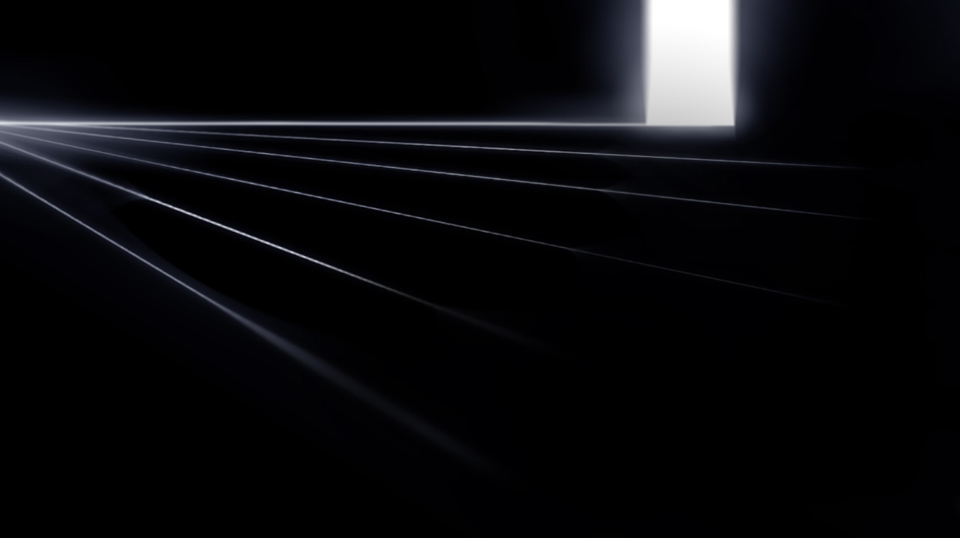
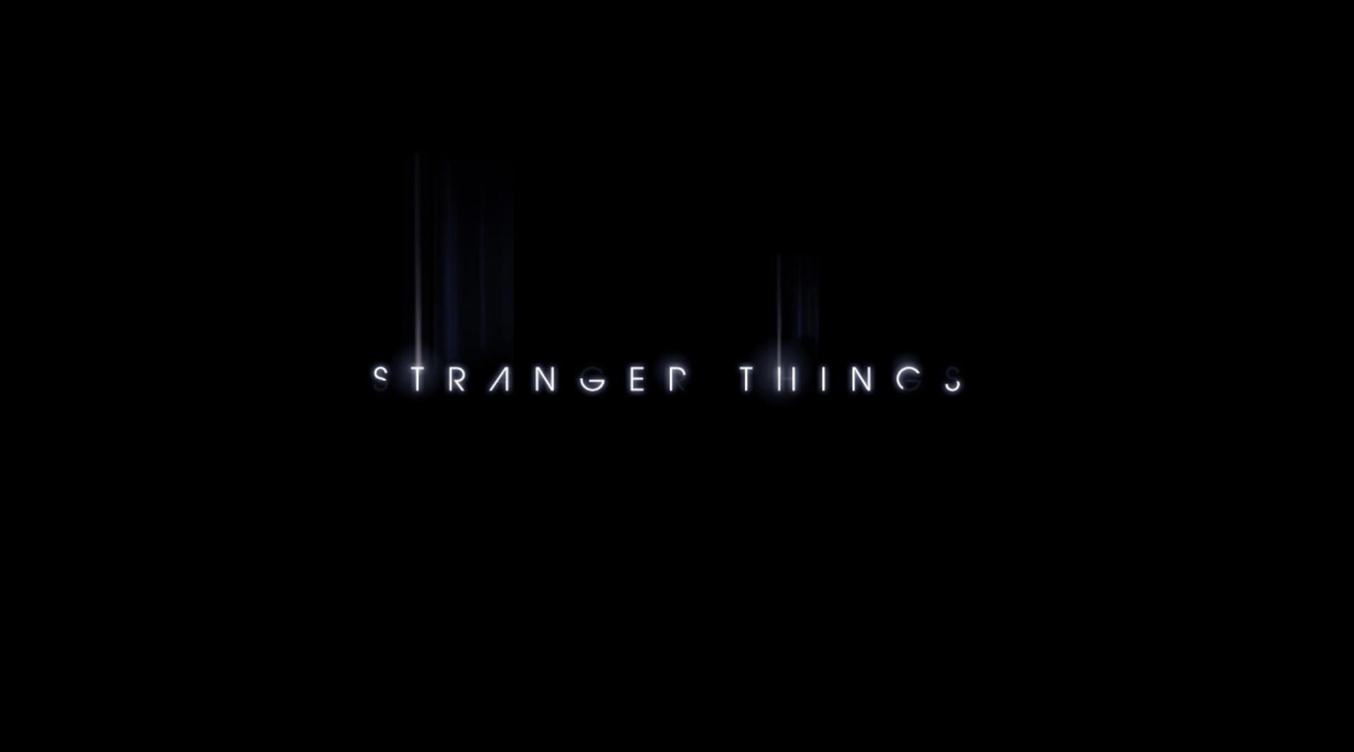
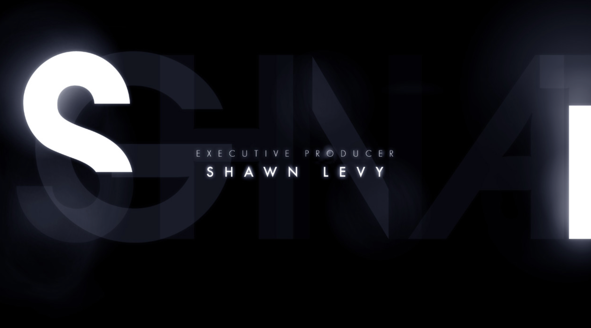
Drafts of the title sequence under the 'Shadows' concept
Ultimately, Michele said that there is something about a 'purely typographic sequence' that any designer would love to work on. The 'Shadow' concepts were eventually set aside in favour of the typographic approach that characterises the final cut.
The design process for the titles involved the use of physical 'Kodaliths,' an old film format which is a black piece of film with a transparent area where, in this case, the letters would be. By individually backlighting each of these, the designers introduced subtle inconsistencies typical of traditional film opticals, creating a retro yet digital feel that aligns with the show's theme and era. These letters were then animated digitally.
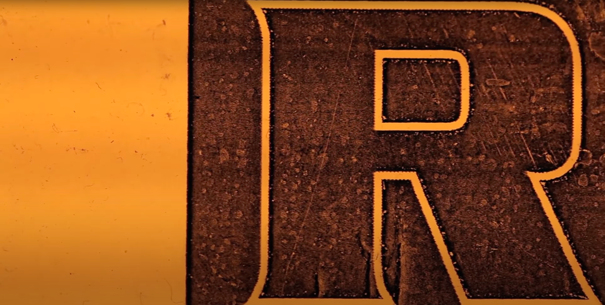
Light being shone behind the 'R' Kodalith.
When animating the sequence, Michele's team created its own grain to overlay it, in Adobe After Effects. Michele goes on to say that, ultimately, 'it was tonnes and tonnes of layering'. She also mentions that they used 'Gorilla Grain' in the sequence, which is real scanned 35mm film grain. This is the same grain that The Duffer Brothers also in the grade of the show.
Chapter Four: The Finale
By drawing inspiration from the art and literature of the 70s and 80s, and blending traditional techniques like Kodaliths with modern digital methods such as layering in After Effects, the 'Stranger Things' title sequence masterfully evokes nostalgia while charting new territories in visual storytelling.
The final title sequence went on to win an Emmy for Outstanding Main Title Design in 2017 and has become a cultural icon in its own right, through the creation of fan-art, merchandise and more. This not only sets the tone for other series to aspire to, but when paired with the synthesizer-heavy opening music by Kyle Dixon and Michael Stein, it also tempts viewers to take a walk into the eerie little town that is Hawkins, Indiana.
Epilogue:
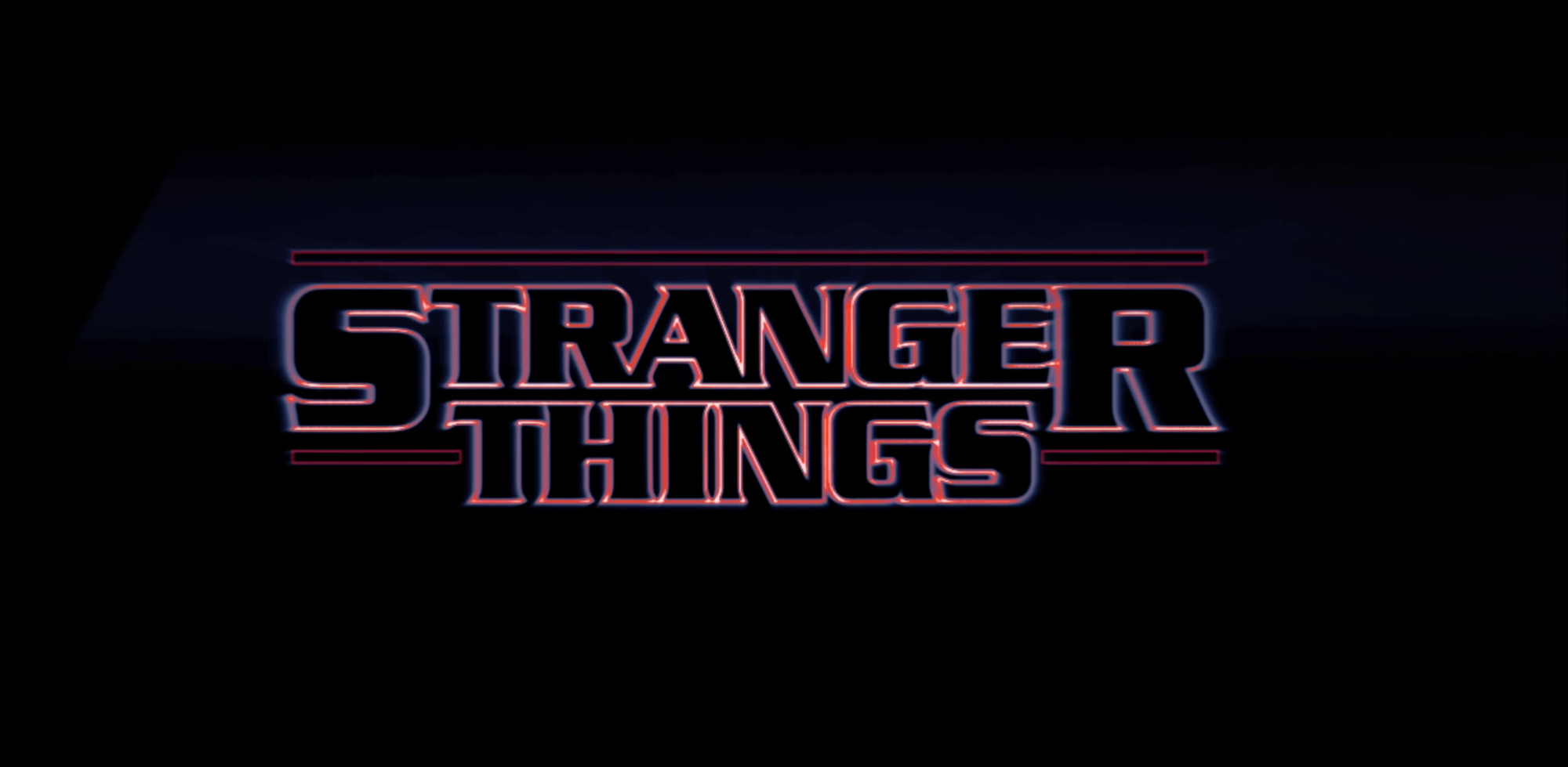
What would it look like if they had chosen a different path? A new font, a new colour, or drawing inspiration from an entirely different source. Wonder no longer—after immersing myself in the history of the title sequence, I experimented with creating several drafts to reimagine the appearance of the titles:
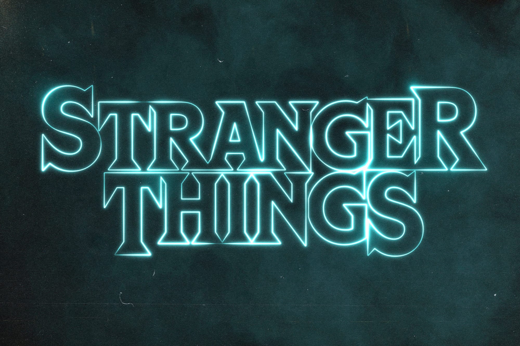
I drew inspiration from the Cortez font, a front runner that Contend considered for use in the original show. While I adopted this font, I infused the design with the neon-outline style reminiscent of the typography in Nick Sharman’s 'The Cats' and which was used in the shows final version.
Further, in Photoshop, I implemented layering techniques similar to those Michele’s team used in After Effects for animation. To evoke the atmosphere of 1980s horror movies like 'The Exorcist,' I incorporated a subtle fog effect, along with introducing noise and film grain enhancements to deepen the vintage aesthetic.
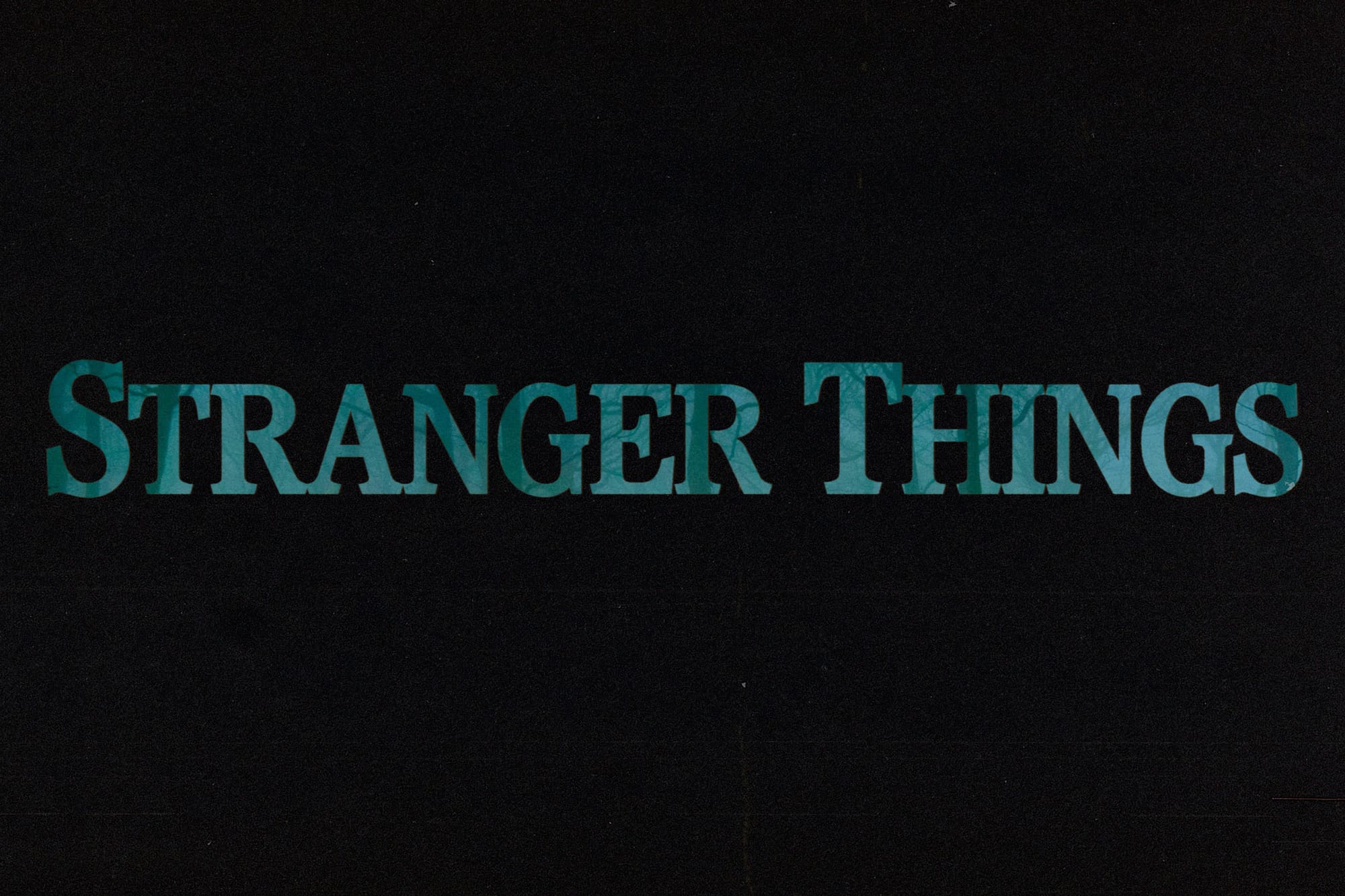
For this version, I drew inspiration from the Altered States (1980) title sequence. In the sequence (as shown under 'Chapter Three') each letter slides individually across the screen, revealing the scene through the shapes of the text. Reflecting the themes of the first series—a hunting party searching for Will Byers and the discovery of Eleven by children taking place in the woods—I selected an evocative woodland image as the backdrop.
For the typography, I opted for Pacella Latina, a font reminiscent of 1980s horror novel covers. Unlike previous drafts, I chose not to stack the two words of the title on top of each other. I then blurred the text slightly and used the 'Ripple' effect to slightly mishape the edges of the text. This combination helps to 'de-modernise' the text, up-keeping the nostalgic vibe.
I added layers of noise and film grain to enhance the vintage feel again, but wanted to achieve the subtle colour inconsistencies at the letter edges. This effect in the "Altered States" sequence likely stems from the use of Kodaliths. To mimic this, I duplicated the text layer, filled it with a mustard yellow colour, and positioned it behind the primary text. Applying Gaussian and Motion Blur effects in Photoshop, I subtly shifted the yellow layer to create a nuanced edge. Although subtle, these details contribute significantly to the authenticity and perceived age of the sequence.
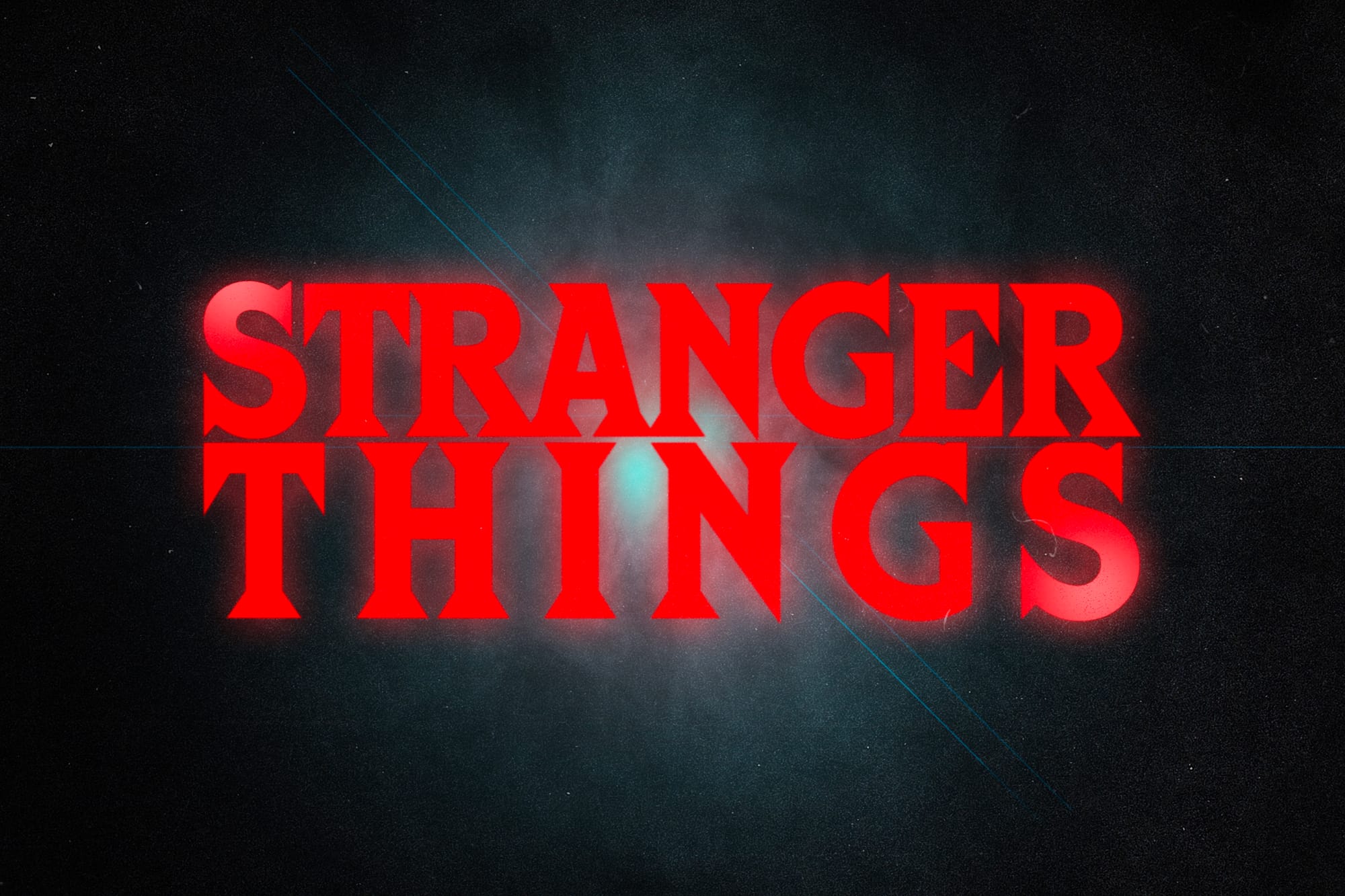
For my final version, I took my inspiration from a poster for Paramount Picture's 1983 movie adaptation of 'The Dead Zone':
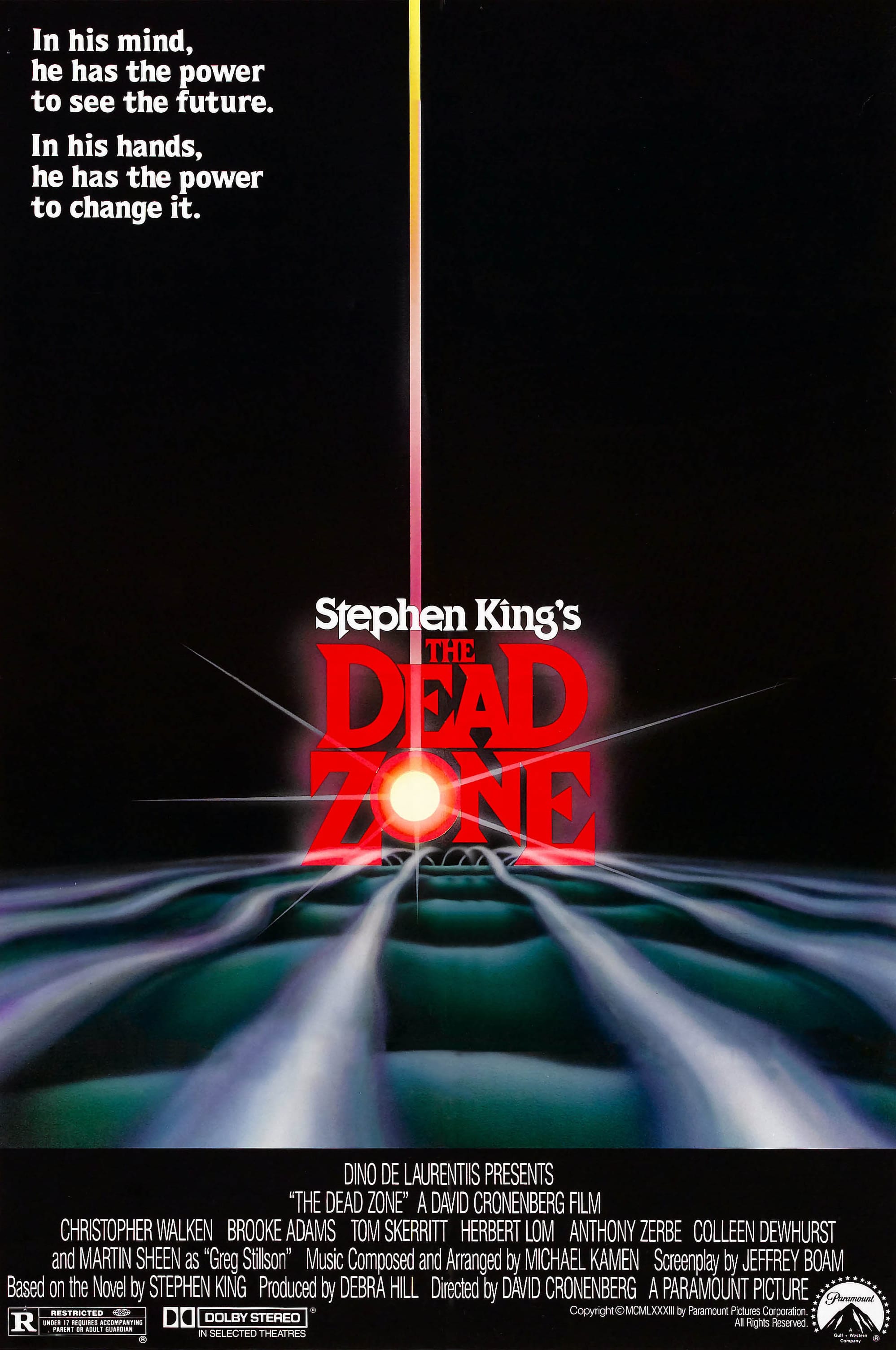
The font used in the poster was one previously mentioned, Cortez. I decided to incorporate this into my design, focusing on solid text and strategic layering. Once satisfied with the typography's boldness, spacing, and color, I introduced a lens flare behind the text. This addition was not only to evoke the quintessential '80s blockbuster aesthetic but also to pay tribute to the iconic poster for 'The Dead Zone'.

