Stephen King's 'RAT' - Faux Film Posters

Last night was one of those nights where sleep was an afterthought. As any dedicated Stephen King reader knows, there's a certain right, almost a ritual, to staying up into the early hours engrossed in a King story. This time it was King's novella "RAT", from his collection "If It Bleeds", that had me hooked. There’s something about his writing that just pulls you in, refusing to let go until you’ve devoured (or should I say nibbled...) every last crumb.
“RAT” had King's 80's style, as if he found an old manuscript from that era in a desk drawer. The setting, the tension, the eerie atmosphere, it all transported me straight back to those classic King stories I grew up loving, and that came out 18 years before I was born.
Here's a brief synopsis for some context:
Struggling writer Drew Larson retreats to a remote cabin in the Maine woods, determined to finish a novel that has eluded him for years. Faced with crippling writer's block and the fear of failure, Drew makes a desperate deal with a mysterious rat that appears in his cabin. The rat promises to grant him the creative breakthrough he needs, but the price is steep—a devastating personal sacrifice. As Drew's writing flourishes, he is haunted by the consequences of his bargain, realising that some deals are better left unmade. "RAT" explores the dark side of ambition and the moral dilemmas faced by those driven to create at any cost.
Hours after finishing the book, I found myself buzzing with creative energy. King's prose is so vivid that it practically transforms into a film in your head as you read it. Inspired by this, I decided to channel that energy into creating posters for a faux film release.
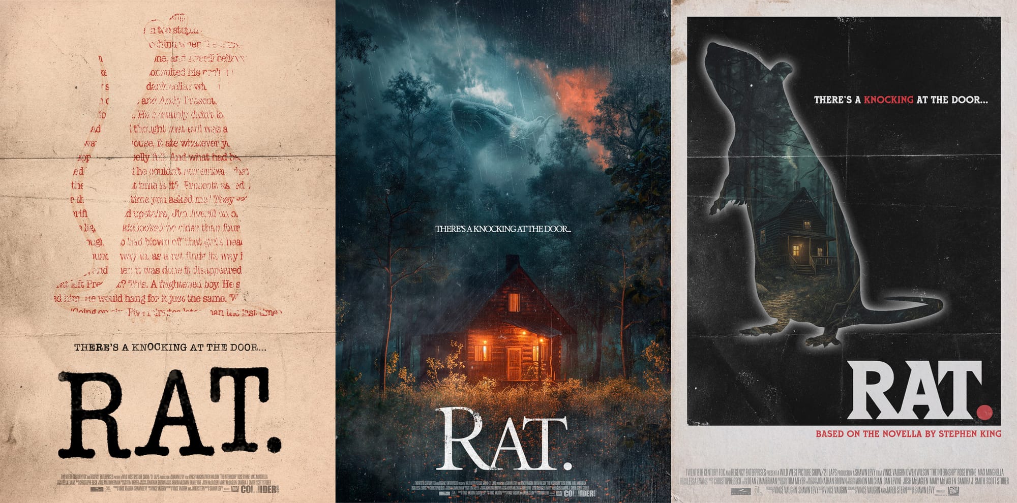
POSTER #1

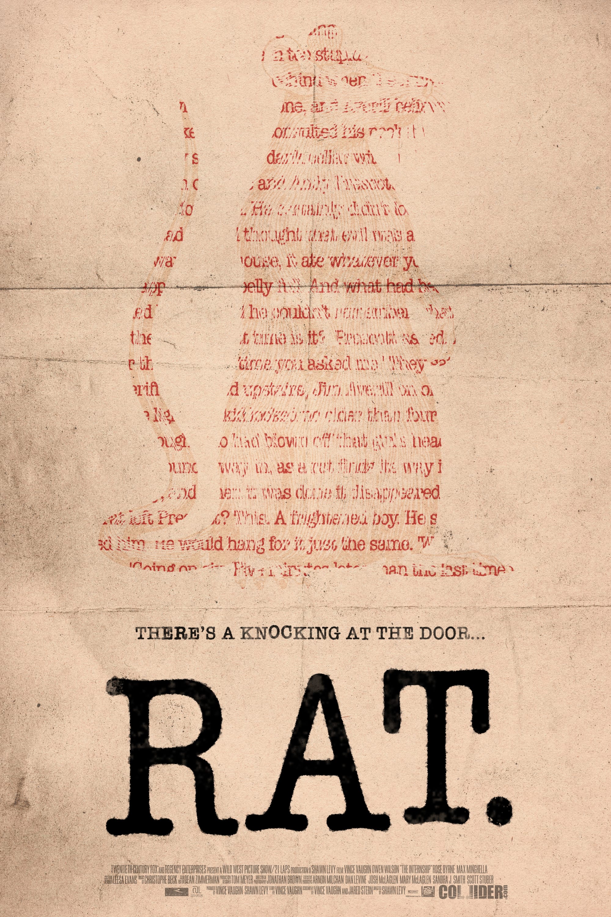
In the story, Drew Larson uses a typewriter for part of the writing process and I became inspired by the look of the stamped letters. I used 'American Typewriter' from Adobe Fonts to create the typography, altering the spacing, height, and boldness of the letters to give it that rickety, imperfect look characteristic of typewritten documents. I then used the Crystallise tool and changed the blend mode of the type, so it looked like ink that has infused into the paper.
I knew I wanted to incorporate the shape of a rat in my poster and to combine it with the written word. I used a passage from the book Drew writes within the novella and cut out a section in the shape of a rat, turning the text colour to red to emphasize the sinister intentions of the rat in the story.
Finally, I used a vintage paper texture as the background and added a folded paper texture in the foreground, further tying it back to the writerly theme of the novella.
POSTER #2

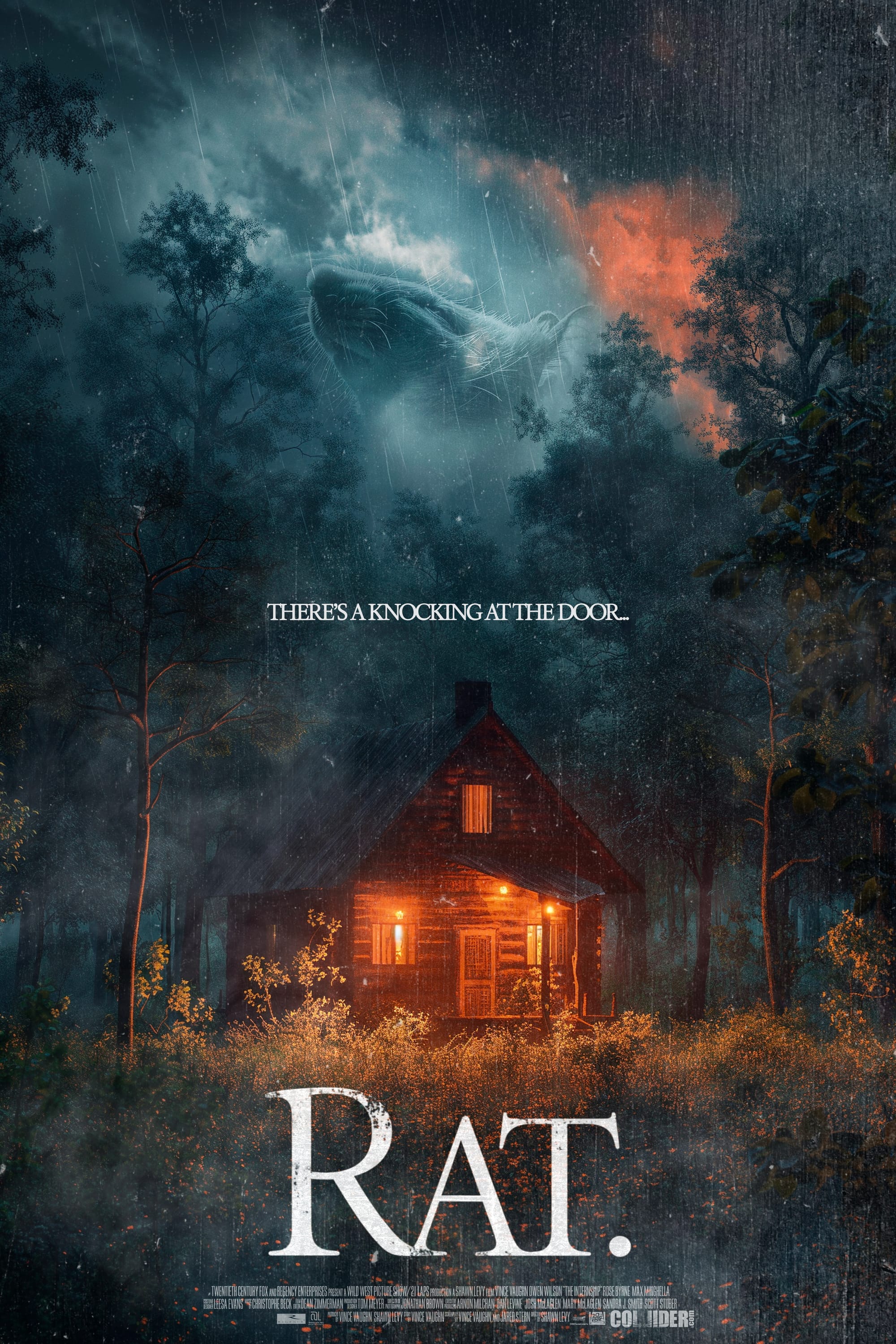
For the second poster, I wanted to lean into the classic horror film posters of the 2010s, like The Cabin in the Woods, The Conjuring, and Sinister. These posters often featured simple typography with a 'roughed-up' look. I emulated that style here but added a twist—making the distressed edges look as if they had been nibbled by a pesky rodent. This subtle touch not only adds a unique element but also ties directly into the theme of the novella.
I also wanted the rat to feature physically in the poster, but without making it look comical by simply placing a mouse in the frame. To reflect its ominous nature in the novella, I placed the motif of the rat in the clouds amidst a looming storm, emphasizing its presence as a genuine threat.
Drawing inspiration from the 2010s horror film posters, I added layers of grime, dust, and noise to give it that grungy look typical of the genre. While I like the poster's atmosphere, I'm not entirely sold on it being my favorite. It's definitely moody and atmospheric, but I'm not sure it fully captures the sophistication of King's writing.
POSTER #3

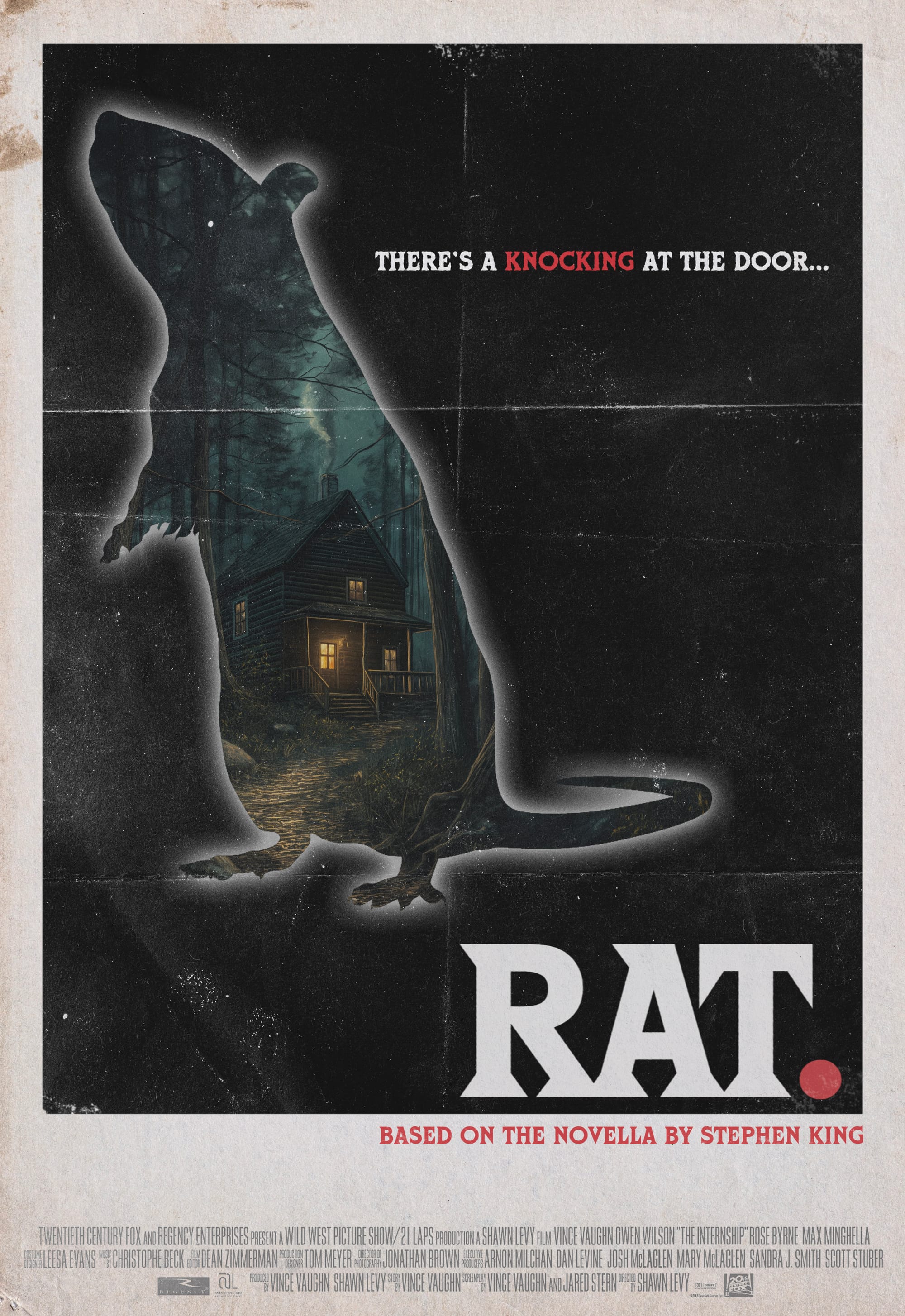
For the final design, I wanted to evoke the horror film posters of the 70s and 80s. The main influence for this one was the poster released for Paramount's Scream in 1980.
To add a touch of retro charm, I decided to reintroduce the folded paper design from the first poster but used Cortez as the font. This font was prevalent on horror book covers and film posters in the 80s. For more on this, read the Stranger Titles article.
I really like the simplicity of this design. It keeps the rat as the main focus, similar to the first poster, but with a noir feel that captures the classy, easy-to-read, yet very effective writing style of Stephen King, as well as throwing a bit of retro in there.

