Colour Me Doubtful: From Mrs. Doubtfire to the Trailer Grading Debate
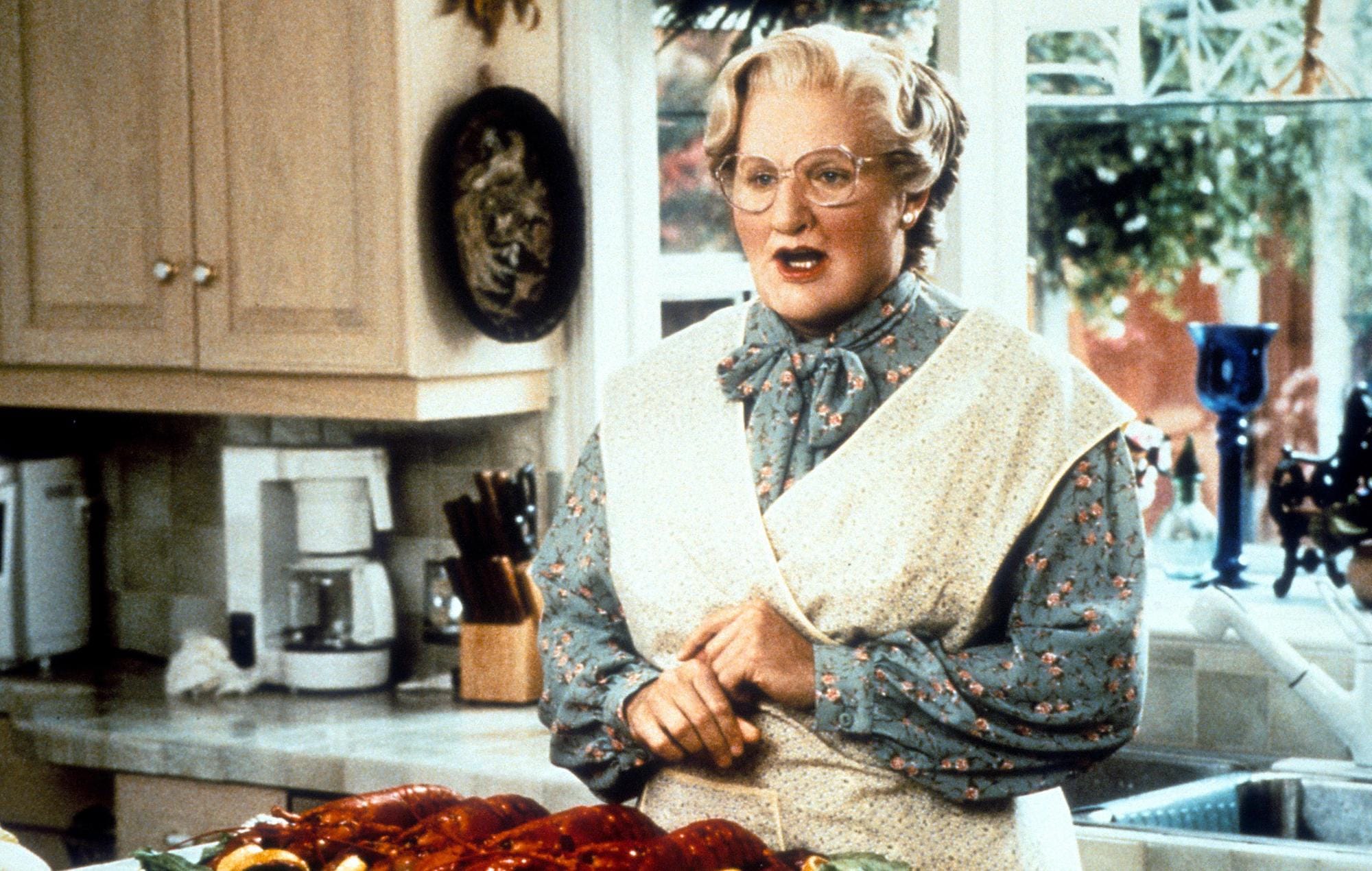
I recently sat down with my parents to re-watch the 1994 classic, Mrs. Doubtfire, a film steeped in nostalgia for me. This must have been the fourth or fifth time I had seen it since I was around nine or ten years old. At the ripe old age of twenty-five, however, it was the first time I recall watching it and picking up on the comforting look and feel of the film. Of course, being filmed in 1993 and released in January of '94, the look and feel of the movie are not intentional and reflect the quality of the filming equipment at the time. Despite this, with the films of my generation being produced in 4K and Ultra-High Definition, the crispiness, warmth, and fuzziness of Mrs. Doubtfire are something I did not know I had missed, and am still hungry for.
The eagerly anticipated blockbuster Wicked, set to be released in December of this year and starring Ariana Grande and Cynthia Erivo, echoes many people's concerns about the future look of the next generation of cinema. Upon the release of the trailer, my X feed and TikTok For You Page became inundated with comments about the look and feel of the footage shown. Users commented that whenever a new blockbuster comes out, it looks 'dull', 'flat' and 'desaturated', demanding Hollywood to understand that Wicked looks 'terrible' with the lighting taking away any spectacle cast from the vast, expensive sets created for the film.
This sentiment was reflected in the recent trailer for the Wolverine & Deadpool movie, which debuted last week. The general consensus among fans was that the overall look and feel of the footage seemed bland. However, numerous viewers pointed out that trailers usually only included unfinished scenes that had not yet undergone final editing, including colour correction and grading. This prompted some fans to mock the so-called 'movie experts' who critiqued the colour grading, earning those critics a spot in the meme hall of fame:
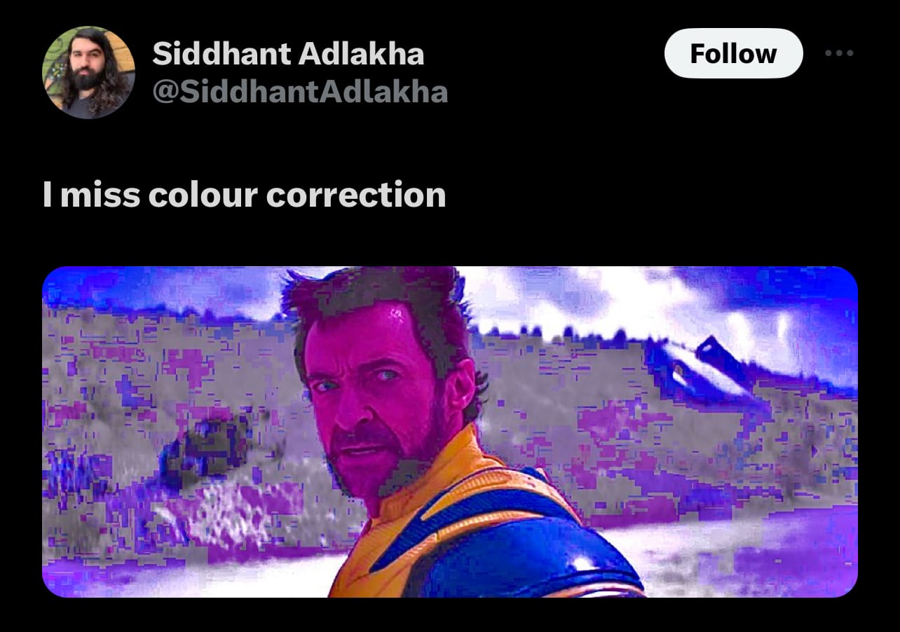

But hold on, hold on, hold on, what actually is colour grading? Well, let me enlighten you (if you pardon the pun)...
What is Colour Grading?
Simply put, Colour Grading (sometimes referred to as colour correction) is a process undertaken during the post-production section of film making. Its main purpose is to alter the colour qualities of footage that has been captured, including contrasts, sharpness, white balance, colour overlays and saturation. Whilst this sounds very formulaic, this process not only enhances the aesthetic quality of the film but also plays a vital role in conveying the narrative's emotional tone, making it an indispensable element of film production.
At its inception, colour grading was used as a tool to ensure there was a consistency in the colour within the film. During the era of physical film reels, this required a photochemical process to adjust colours during film development. While some suggest that colour grading emerged in the 1980s, its origins trace back to the era of black and white cinema. Filmmakers had the option to purchase film with specific tints, and various development techniques could adjust lighting or shadows to enhance the visual style.
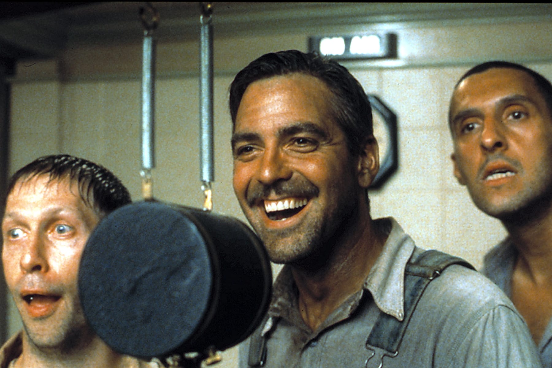
However, the practice of colour grading underwent significant evolution with the shift towards digital filmmaking in the 1990s, which afforded filmmakers greater control over their footage. Notably, the film "O Brother, Where Art Thou?" is often cited as one of the first to extensively utilize digital colour grading to craft its unique visual aesthetic.
In contemporary filmmaking, colour grading has evolved significantly with the advent of sophisticated software, allowing filmmakers to manipulate various attributes of a single shot. Using tools like curves, masks, and colour wheels, filmmakers can fine-tune specific areas of a shot or the entire frame to achieve the desired visual impact. Renowned film-director Wes Anderson is particularly noted for his unique visual style, characterized by the use of symmetry in scene composition and a bold, playful approach to colour that creates a distinct atmospheric depth.
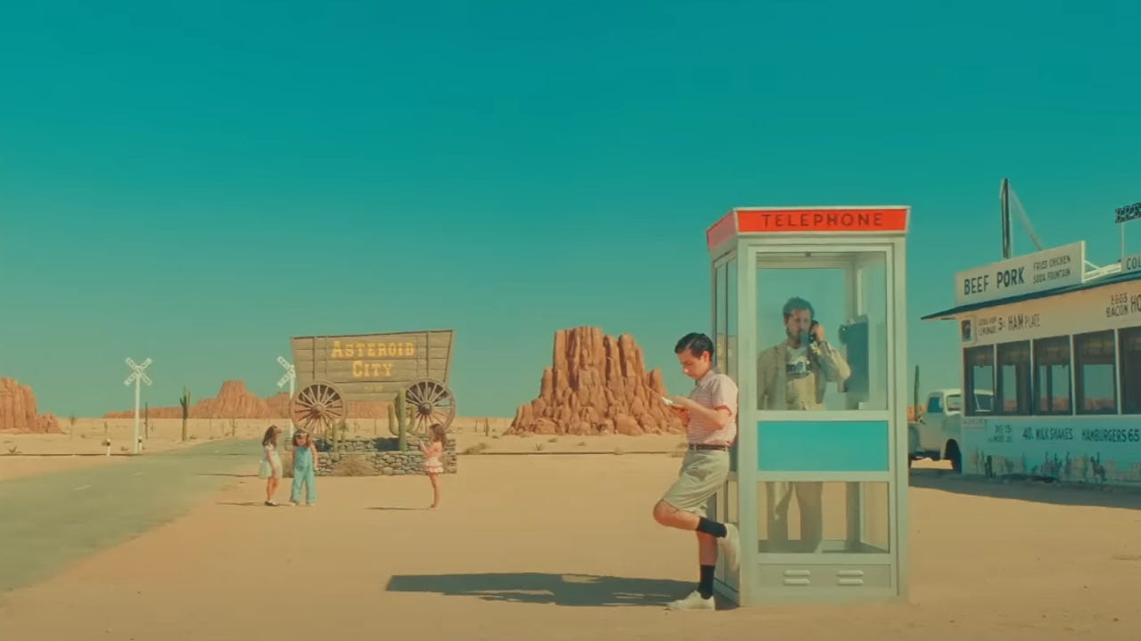
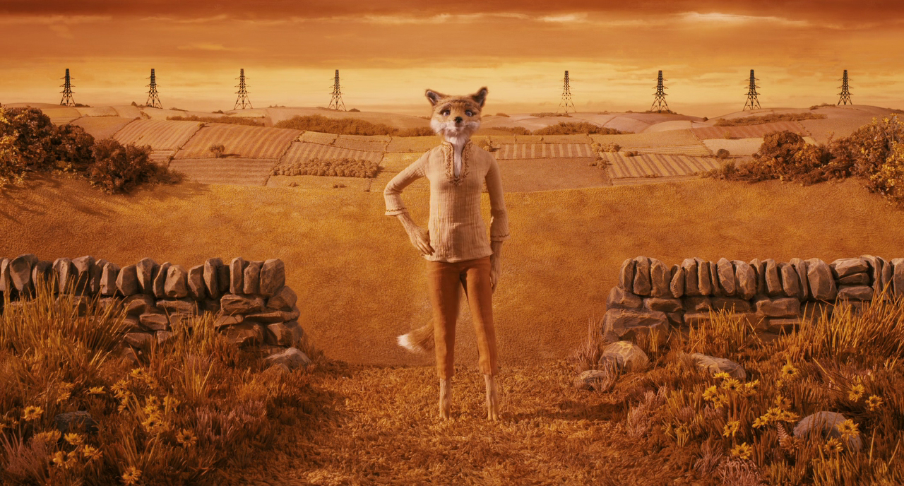
Left: Asteroid city | Right: Fantastic Mr. Fox
For instance, his 2009 film 'Fantastic Mr. Fox' is bathed in warm hues of red, yellow, and orange, avoiding cooler tones to enrich the narrative's rustic charm. In a stark contrast, his 2023 film 'Asteroid City' adopts a unique low contrast and targeted saturation, drawing inspiration from the 'desert sun' aesthetic prevalent in the 1950. These stylistic choices exemplify how colour grading is integral to crafting a film's visual narrative.
So, what is going wrong? If the filmmakers of today have such a variety of tools at their disposal, why is there such a discourse over the colour grading of footage released from early anticipated blockbusters such as Wicked or Wolverine & Deadpool?
Firstly, as Screen Rant notes, it may be unfair to critique the quality of Wicked based solely on a one-minute snippet of footage released nine months prior to the film’s premiere night. The editors are still refining the CGI, special effects, and colour grading, and with six months still ahead of them, they are likely to continue these enhancements.
Secondly, my impression is that upon first viewing footage from a highly anticipated blockbuster, there's a tendency to scrutinize every aspect of the visual presentation. Without the complete context of the score and unfolding storyline, it’s challenging to fully assess a film’s quality. It is only after experiencing the film in its entirety that one can truly evaluate the visuals, character development, and plot. In addition, it is unfair to critique the work of the film’s editors when it is usually their work that is carried out last and so is, as yet, incomplete.
Finally, Raw and Log formats have significantly influenced color grading. These formats record a broader range of brightness and color data from a scene, but typically appear 'unfinished' when they come straight from the camera. It is then up to the colorists and editors to enhance these raw captures with the necessary color, brightness, and contrast during post-production. These formats are preferred because they retain more detail without compromising on quality, unlike other formats that approximate these levels automatically.
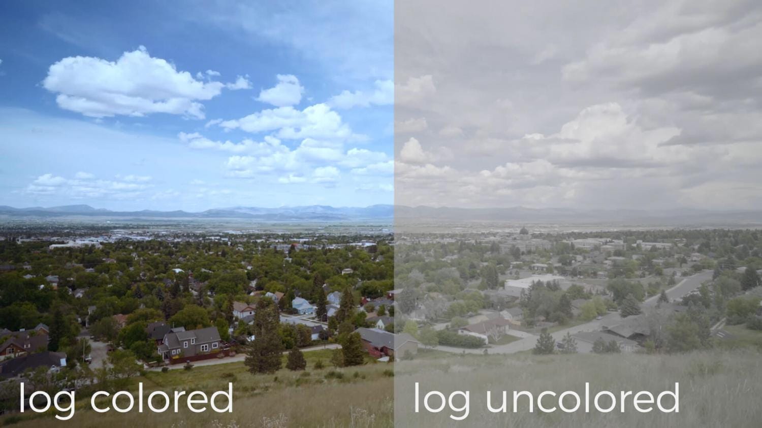
Consequently, the urgency to release movie trailers might result in the use of footage still in its Raw format, which has not yet been refined by post-production enhancements. Therefore, the seemingly dull and uninspired footage is often not a reflection of subpar editing but a direct response to the demand for early previews. This may, to some extent, explain why early trailer footage may not represent the final visual quality of the movie.

